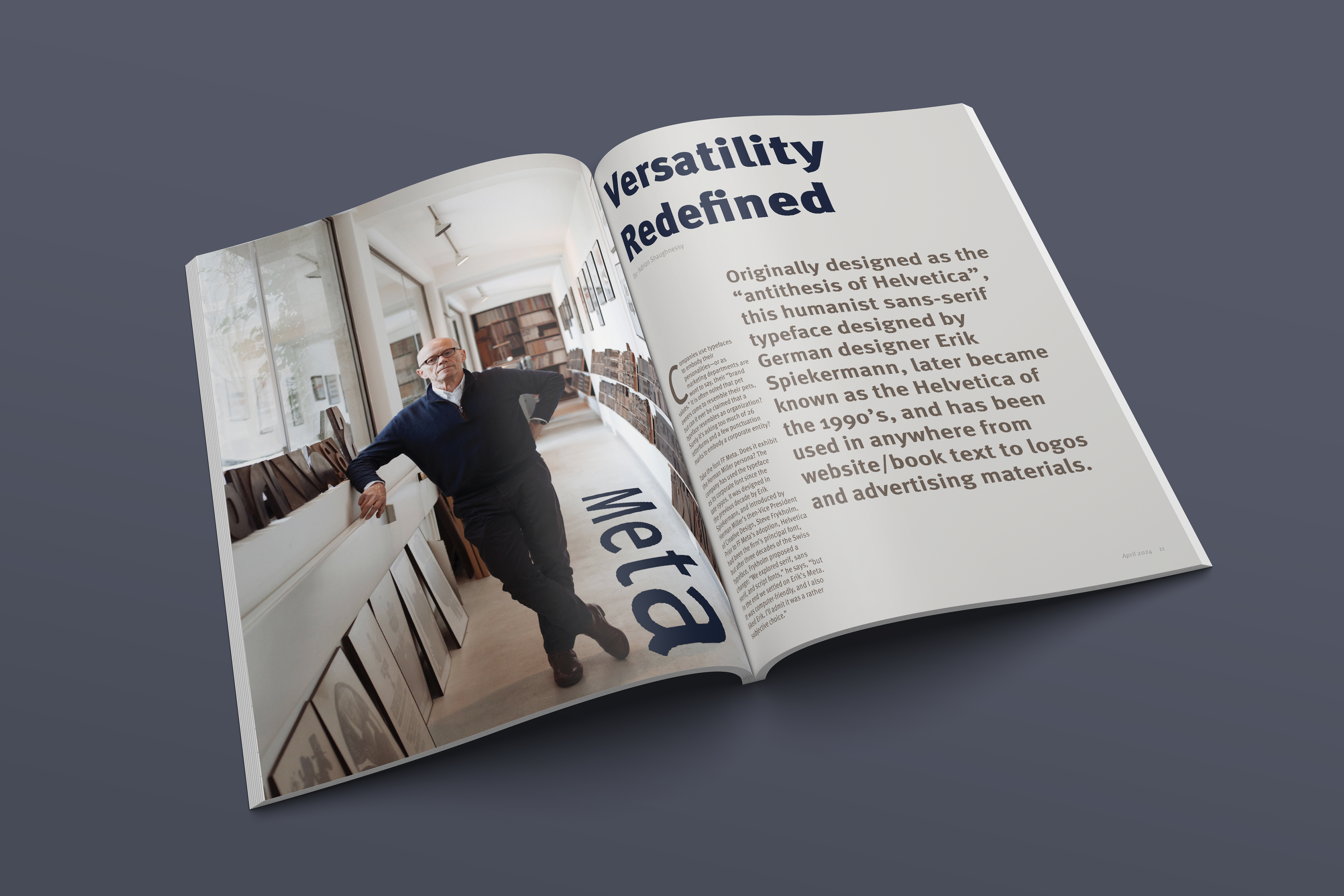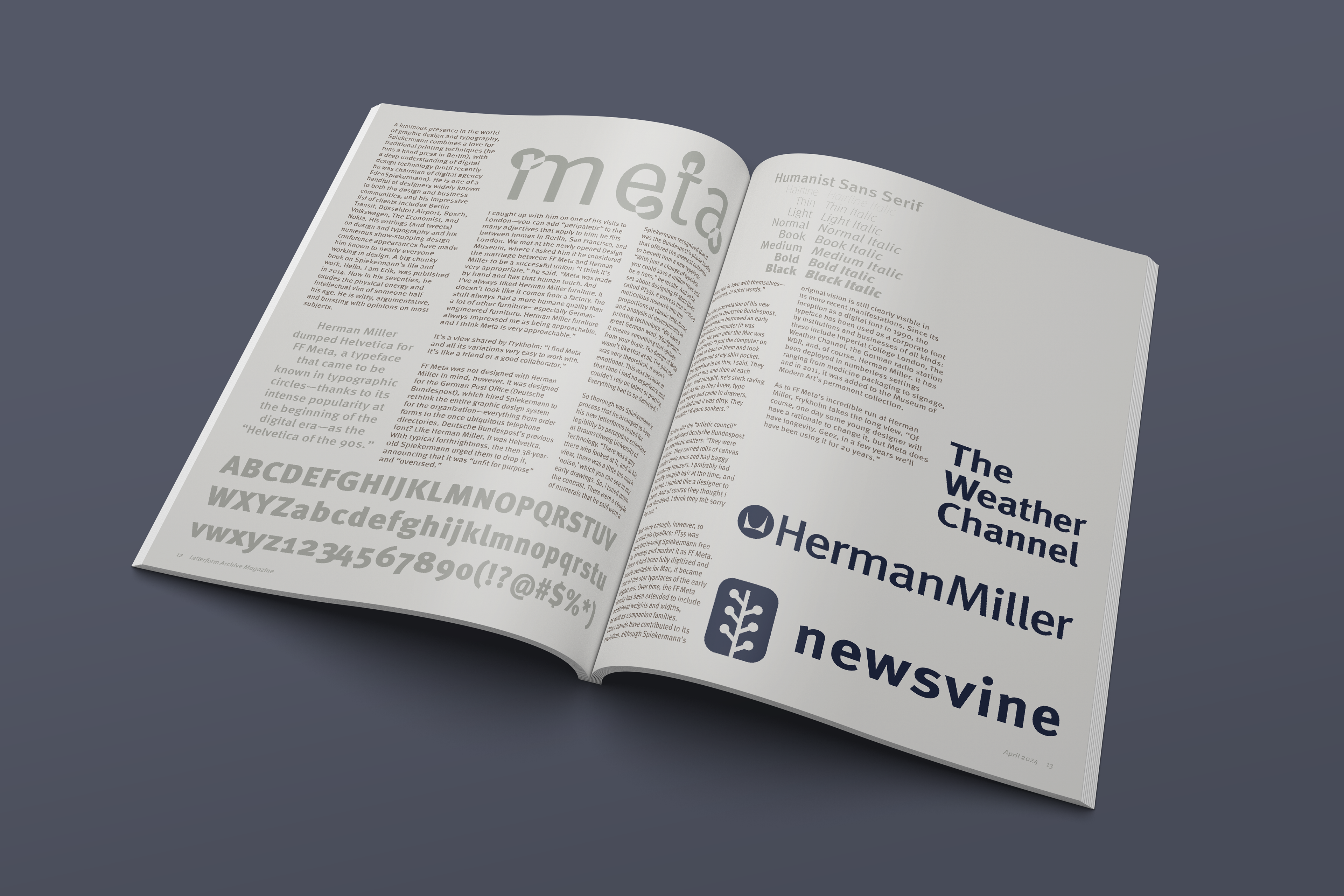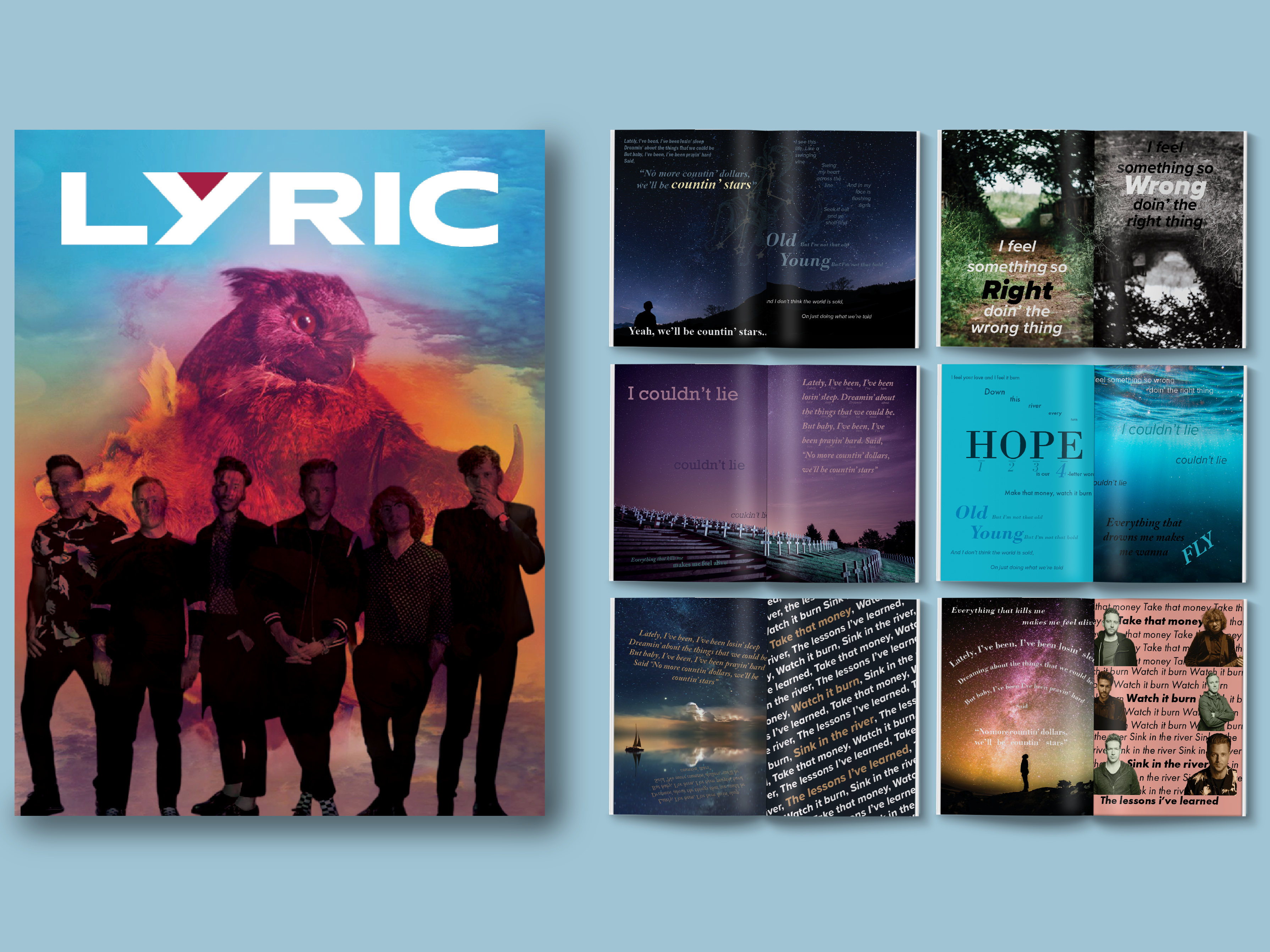
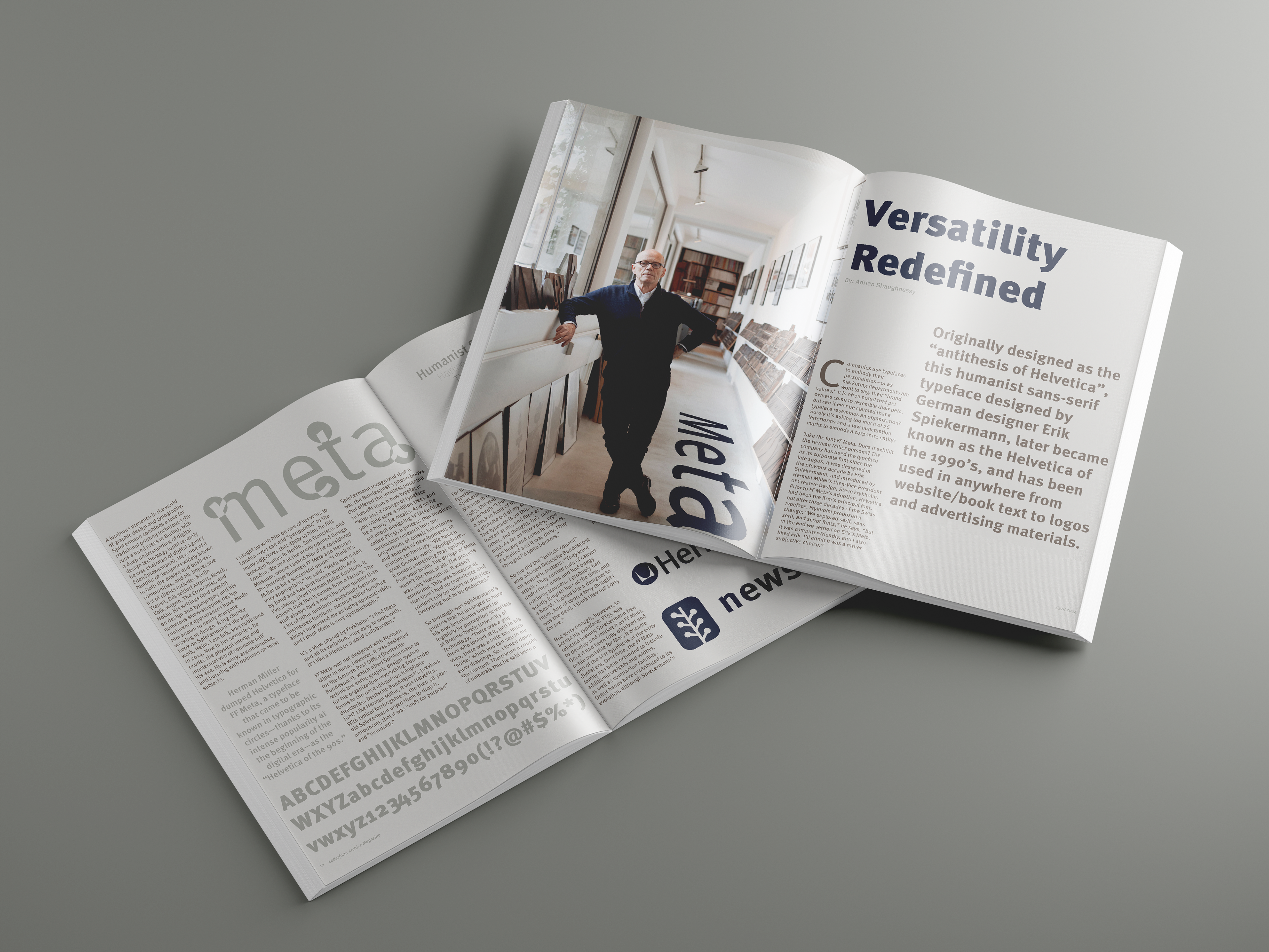
This magazine spread was created for an Intro to Typography course at San José State University and explores the humanist sans serif typeface FF Meta by Erik Spiekermann. Designed on a strict three-column grid, the layout emphasizes typographic hierarchy, scale, and contrast, using FF Meta exclusively to visually support the written research. Color, imagery, and pull quotes were used to highlight the typeface’s versatility and real-world applications, reinforcing the concept behind the title Versatility Redefined.
Skills & Software
• Adobe InDesign
• Visual Hierarchy
• Research
• Organization
• Layout & Composition