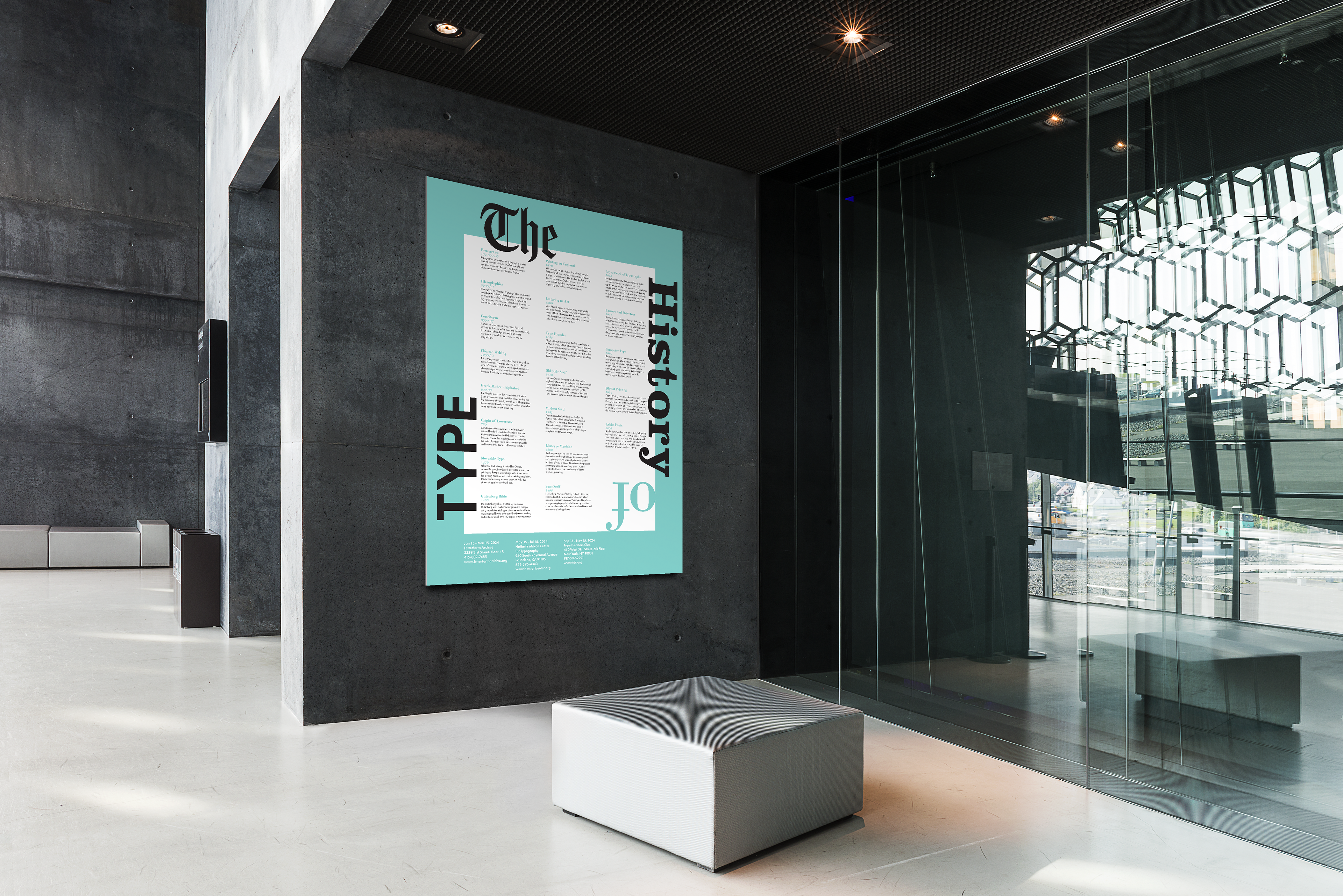
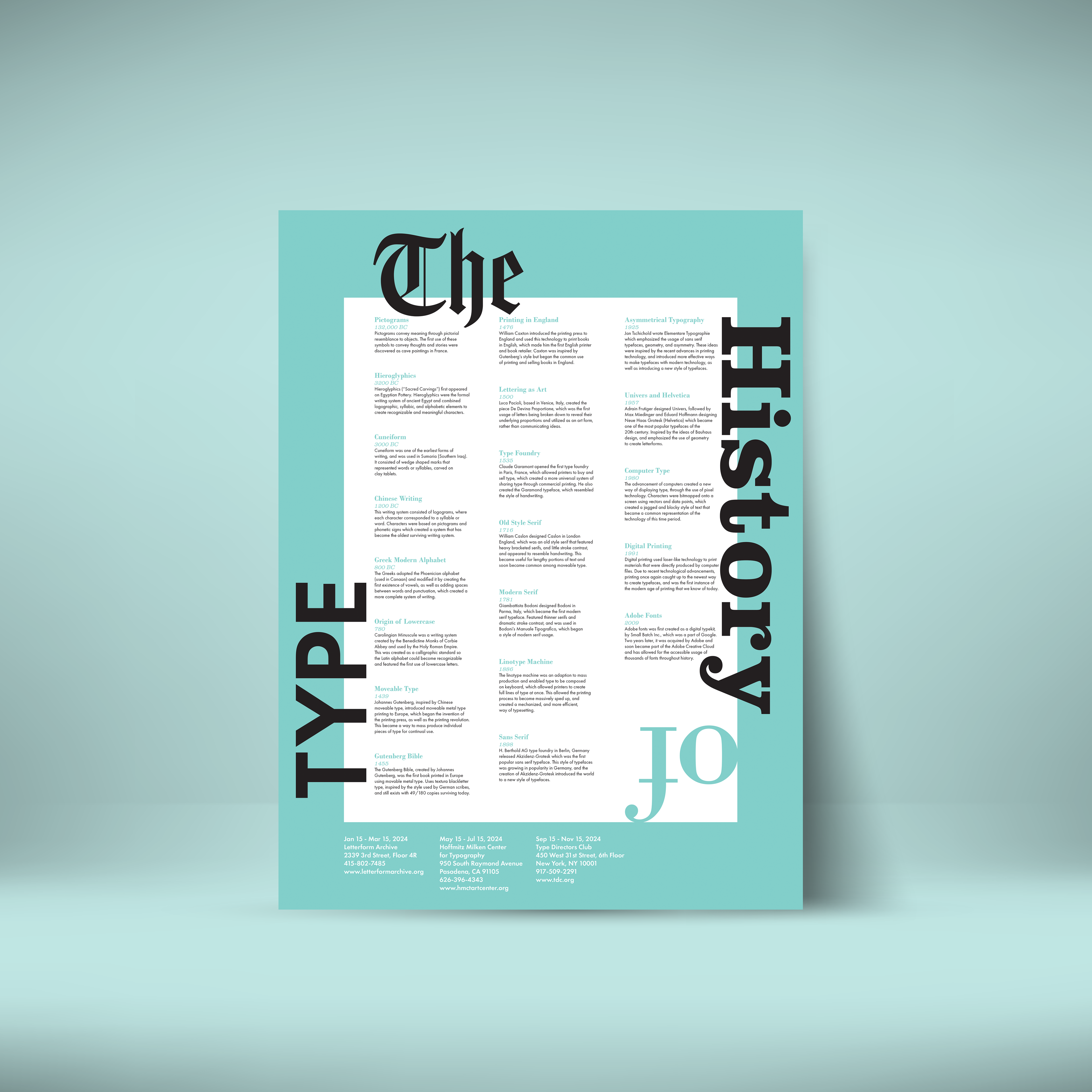
This two–color poster was designed for a typography course at San José State University and explores key moments in the history of type. I focused on visual hierarchy—using color, scale, and typeface selection to guide the viewer’s eye and tell a clear story. From Blackletter to Futura, the font choices themselves helped represent the timeline of typographic evolution. The result is a clean, research–driven design that blends historical context with intentional layout and a touch of creative flair.
Skills & Software
• Adobe Illustrator
• Experimentation
• Attention to detail
• Research
• Font Selection