The Project
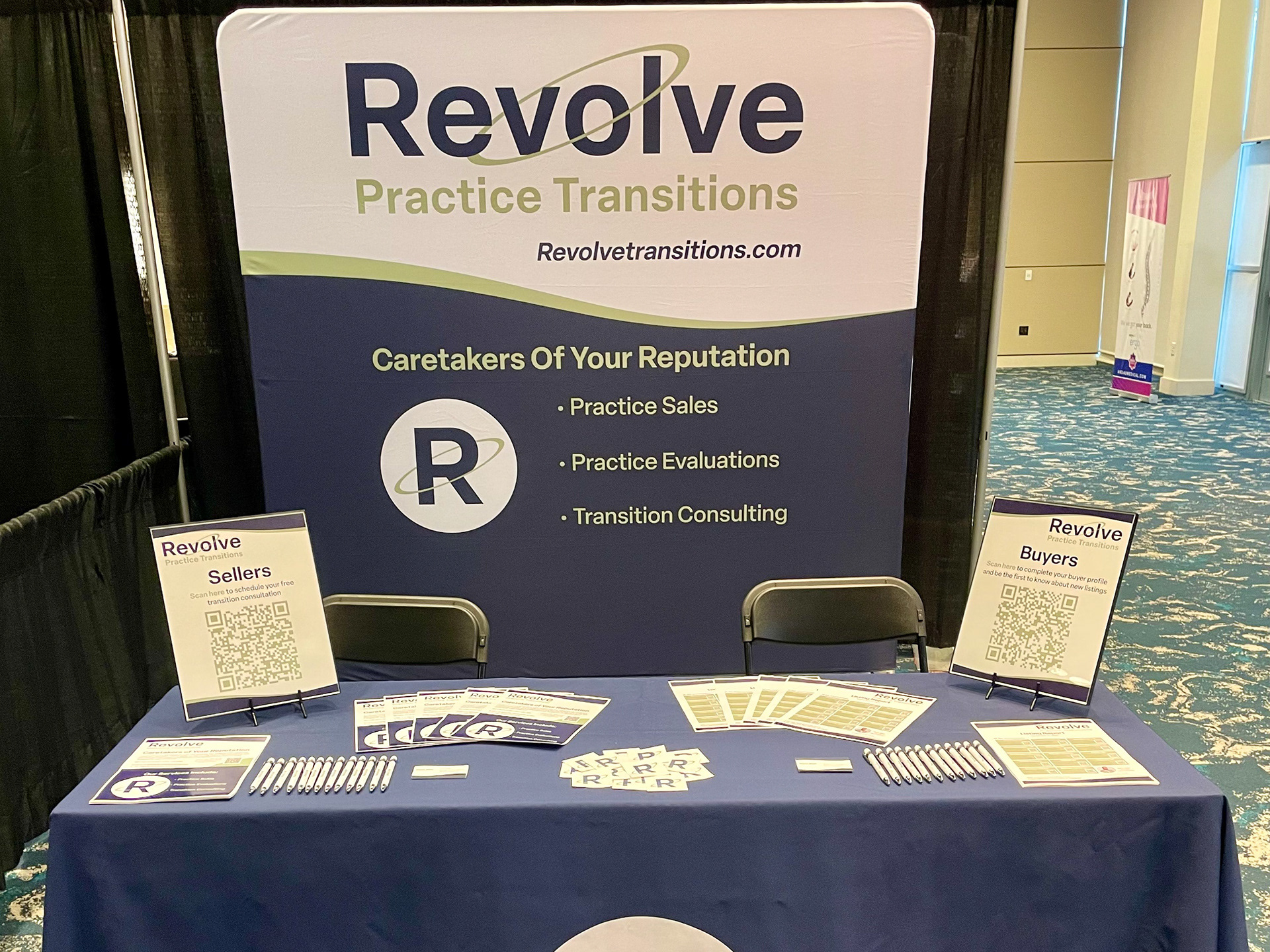
For this project I completed a company logo and favicon design, as well as coming up with the branding and name of the company. I was initially brought on to come up with a logo concept, however, the client thought my concept was strong. So, I was asked to finalize this design and create the end product for the logo
The Process
I initially began this project by coming up with ideas for the name of the company. I was given the “Practice Transitions” portion, and I was asked to pitch ideas that could work with that phrase.
Once I had an idea for the name, I began sketching out some possible ways to visualize the logo itself. With all of this together, I then presented my idea to the client, which was received very well.
Once the idea was accepted, I was given a general guideline for font and colors. I was asked to find something professional, yet modern and with energy. Also, the client wanted to use navy blue as one of the colors, and I was asked to find a secondary color that worked well.
So, I went through a series of presenting different fonts and color options, until ultimately, it was narrowed down to Elza Semibold, with a navy blue and sage green color scheme.
After this was finalized, I used my initial sketches to put everything together and come up with this final product using Adobe Illustrator.
The Purpose
This project had two major parts to it that I was working on to come up with: the branding and company name, and the logos.
Brand
To start out with the brand idea, I had the client fill me in on what kind of service he would be providing, and what his goals were. After I had more information about this type of business in general, as well as how the client wants his business to operate, I began with ideas.
My first thought was focusing on the word “transition”. When I think of transitions, I
think of doors. I was specifically thinking of the phrase “When one door closes, another opens”. Since this business helps with the transition of a business under one person to new leadership, I decided to move forward with this idea.
One of the things that I didn’t like about that phrase was the closed door part. You don’t want the door to close on someone exactly, you just want to be in a different place. So, I began thinking of revolving doors. The door is never really closed, and people can go in and out and end up in the same, or new place. This also allows for multiple opportunities, and isn’t simplified to a single opened and closed door.
I felt that simplifying revolving to revolve made the name stand out more as an action, rather than a descriptor. Once I had the name, the other place my mind went was thinking about the revolutions of planets. A revolution is when one object orbits around another. With planets, this is what leads to seasons. So, I felt that this imagery was once again perfect, because people and businesses go through seasons in their existence, and some bring you to a new place, while others bring you back to before.
This way of thinking inspired the orbit imagery that I used in the logo. Once I had this visualization I was able to pitch my idea. The other thing that I left room for is a cheesy tagline. For example, “Our business revolves around you”. I felt that by using this name, the door is open for plenty of puns that can be used to lighten the mood but also show commitment to their clients.
Logo
After coming up with the name for the business, I began with my initial sketches. I experimented with different orientations of the revolution motion. I tried a top down view, a sideways view, and an angled view. Ultimately, the client and I felt that the angled orientation was strongest.
By using this particular orientation, I felt that I was now moving away from the revolving door imagery, and towards the planetary orbit imagery. I initially used arrows, but felt that those became unnecessary and difficult to see at smaller sizes. So, I instead used a solid line and felt that the general motion was still shown through this image and didn’t need the arrows anymore.
While doing this, I experimented with 3D rotations that allowed me to rotate an object across the z-axis. To add a hidden feature to the logo, I decided to rotate this orbit design exactly 23.5 degrees on the z-axis. This is to match the exact axial tilt of Earth, and serve as a unique feature for those who recognized this fact.
Afterwards, I experimented with different color schemes. I was provided a Navy Blue color to use as one of the colors, and felt that a two-color, color scheme would be ideal for this particular design. To go with a cool color scheme, I chose green, and played around with different saturation and brightness levels of green.
I ultimately settled on Sage Green. After some research, I found that not only do these two colors blend well together, but Sage Green represents wisdom, intelligence, and experience, while Navy Blue represents stability and trust. This was once again a perfect connection since these were the exact characteristics that the client wanted to display in his business.
Finally, I selected a sans serif font that had the right balance of curves and geometry. Within this font, I chose a semibold version which allowed the logo to appear more stable and clear from various distances.