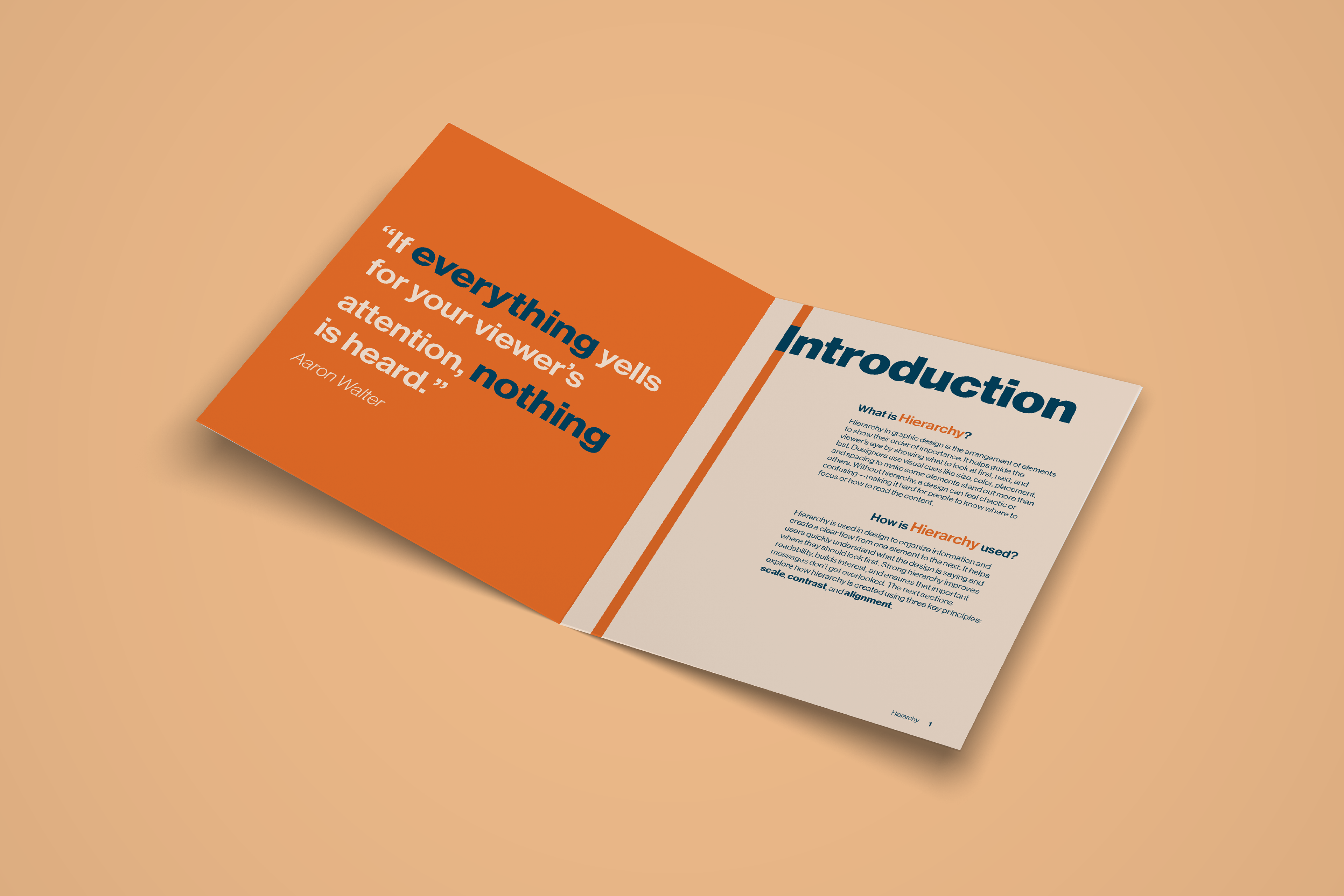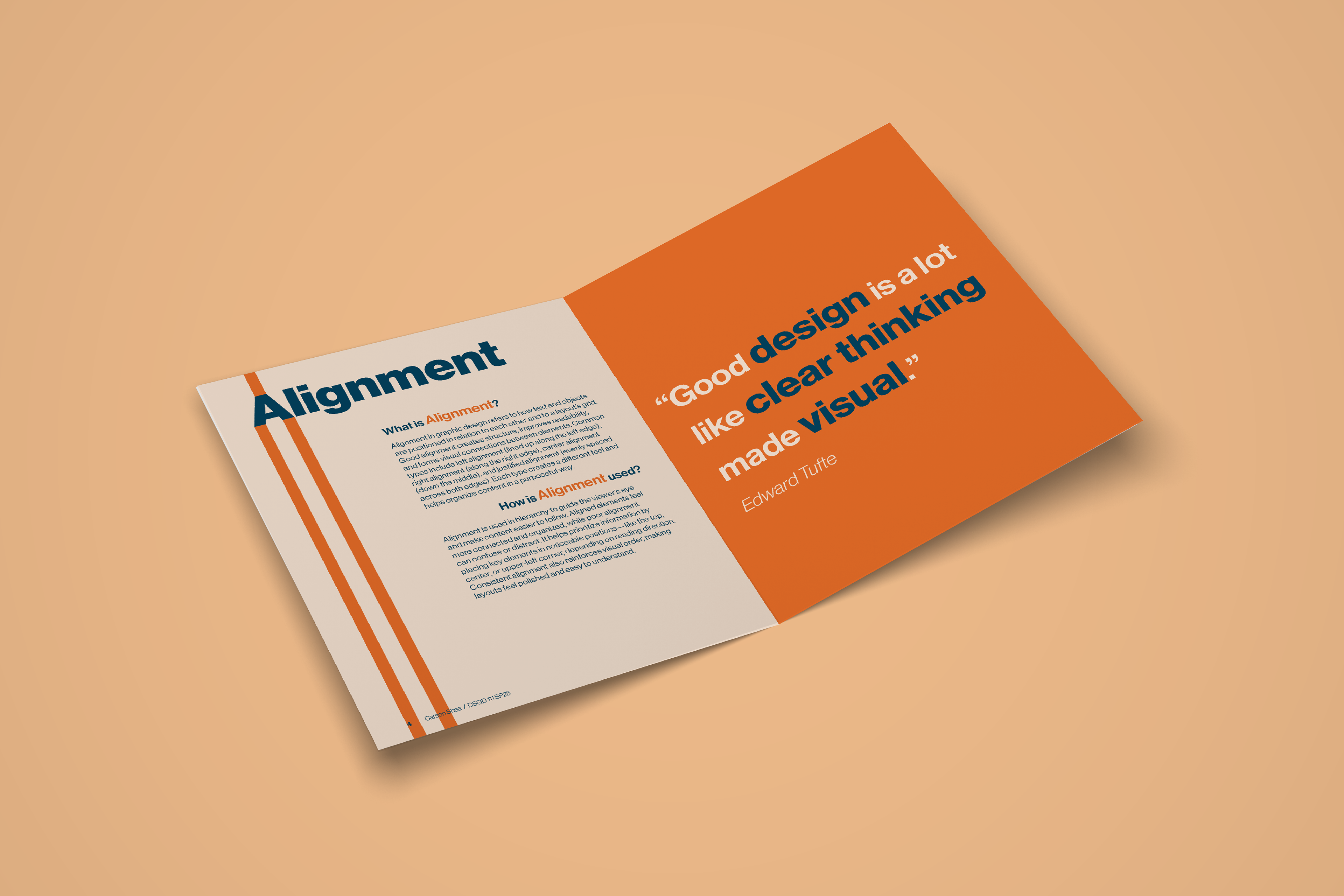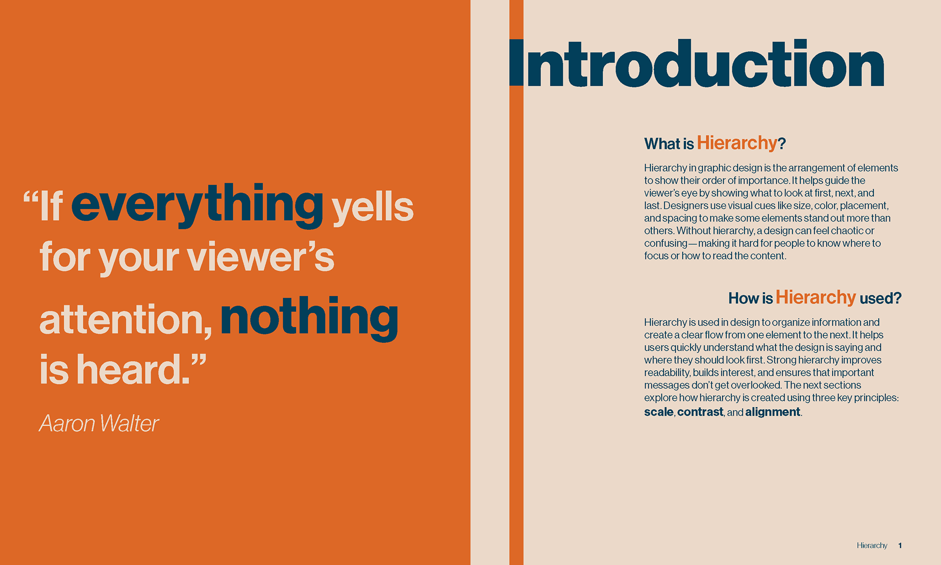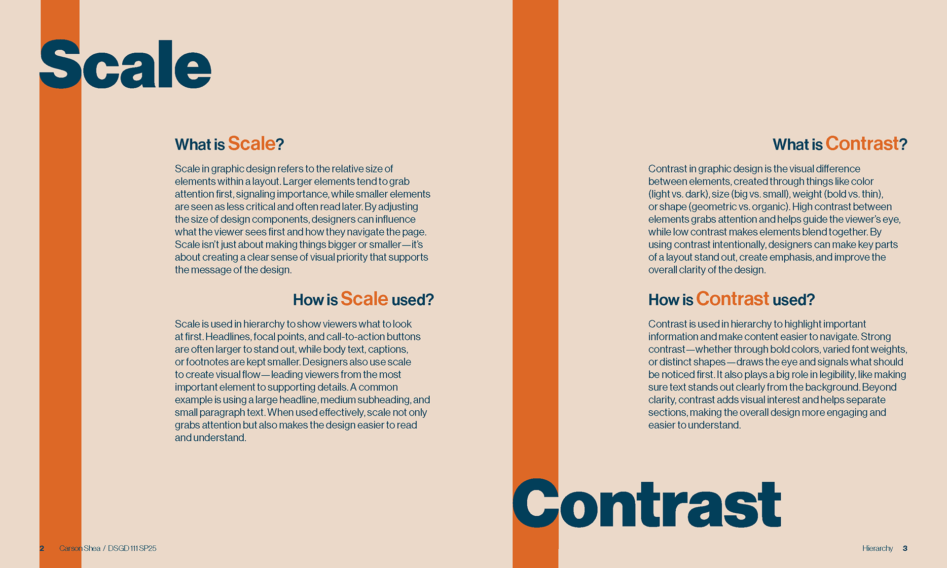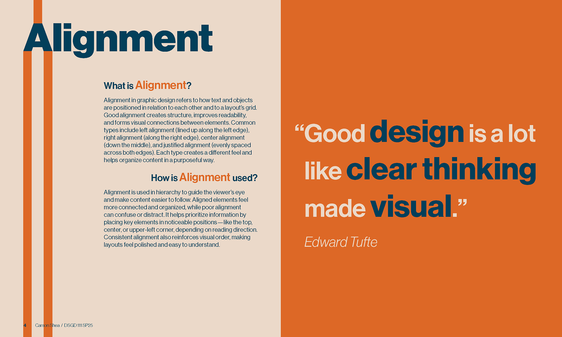
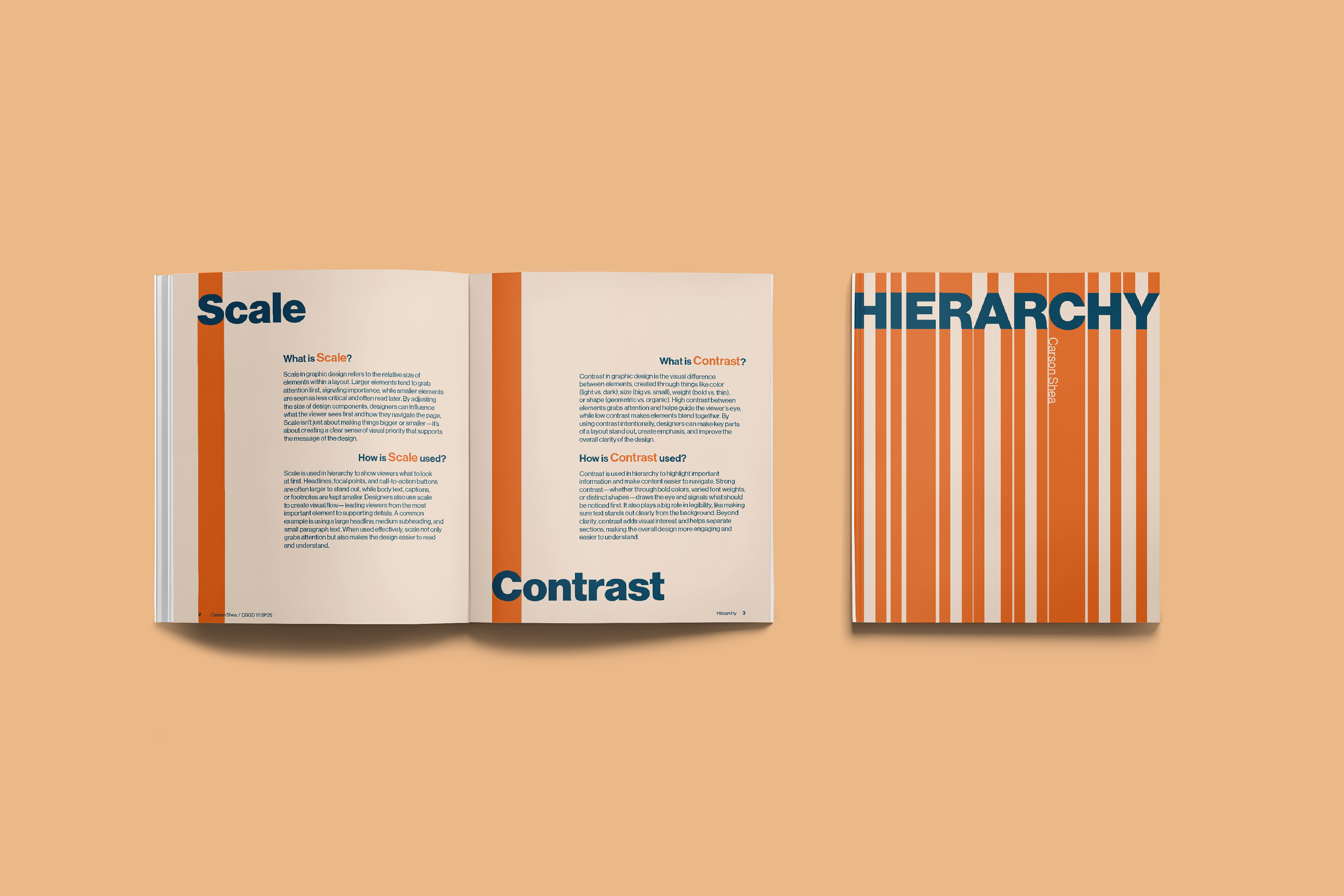
This booklet explores the principle of visual hierarchy by making hierarchy both the subject of the content and the foundation of the design itself. Structured into four sections—an introduction followed by scale, contrast, and alignment—the publication combines original research with a consistent editorial system to explain how hierarchy helps organize information and guide a viewer's attention.
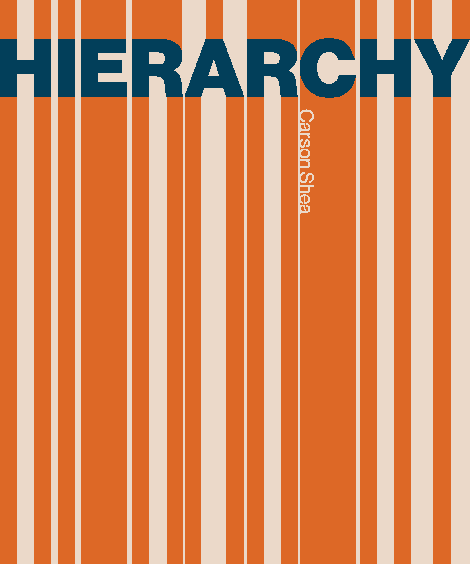
Every design decision reinforces the concepts discussed within the booklet. Scale, contrast, and alignment establish a clear reading order throughout each spread, while repeated layouts create consistency across chapters. The cover extends the vertical strokes of the title letters into a continuous pattern that wraps around the booklet, reflecting the way hierarchy naturally guides the viewer's eye through a composition. Together, the project demonstrates how thoughtful typography and layout can communicate design principles through both written content and visual experience.
Project Skills
• Adobe InDesign
• Typography
• Editorial Design
• Information Design
• Visual Hierarchy