The Project
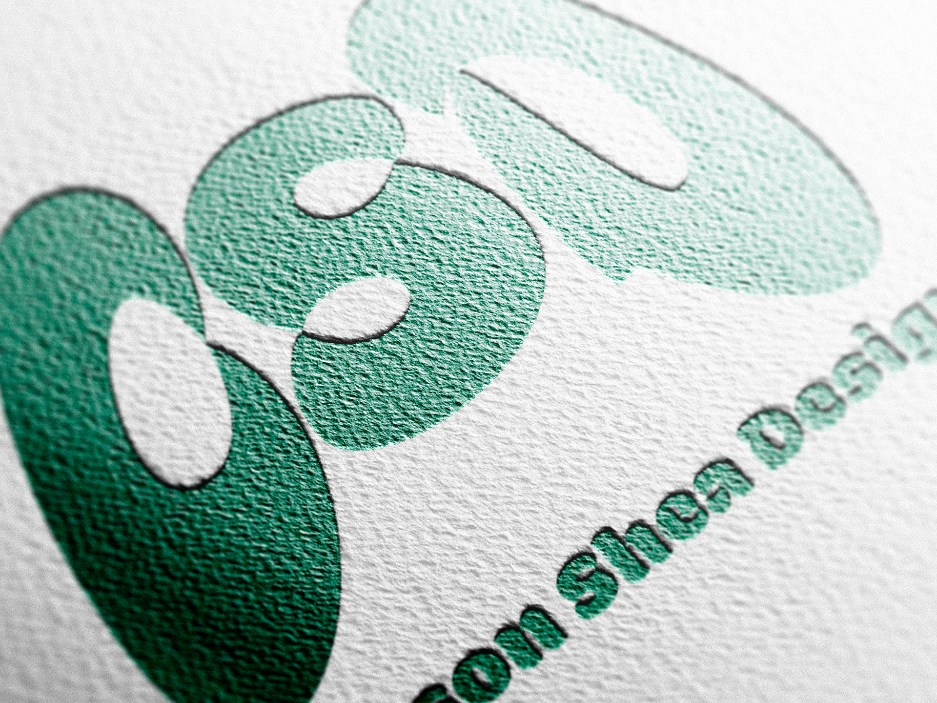
After starting an Instagram account under Carson Shea Games, where I could post my game design projects, I needed a logo. This logo was the first iteration of my own branding, and was used as a profile icon, a LinkedIn banner, as well as an overall representation of myself and my projects.
The Process
The goal of this logo was to connect game design, with graphic design, as a way of becoming a representation of myself.
Through a combination of golden ratio circles, and straight horizontal and vertical lines, I created this logo using Adobe Illustrator.
I wanted to have the silhouette of a video game controller, and have my initials (CAS) fit within this shape.
Finally, color was added to draw attention to certain parts of the design, and create negative space in other parts. This overall allowed me to experiment with new tools I had learned on Adobe Illustrator, while diving into the realm of branding a bit too.
The Purpose
I wanted to create something unique and recognizable for myself. I chose to create this logo entirely out of golden ratio circles so that the logo’s shape would become something aesthetically pleasing.
The shape builder tool became my best friend on this project and allowed me to morph the initials of my name into shapes that could fit within a game controller. I chose to make the remaining pieces black so that there would be less attention drawn to these shapes, creating negative space, while still maintaining the overall controller shape.
The buttons and D-pad were added in as a way to make the controller more recognizable, and fill some of the negative space with shapes that engaged the viewer and contributed more to the overall logo
With the color, I first chose green, with it being my favorite color, followed by the direct complement to engage the composition. I also felt that green symbolized calm and peace, while red symbolized passion. This got across my desire to combine my passion with what I felt to be a good representation of myself.
