The Project
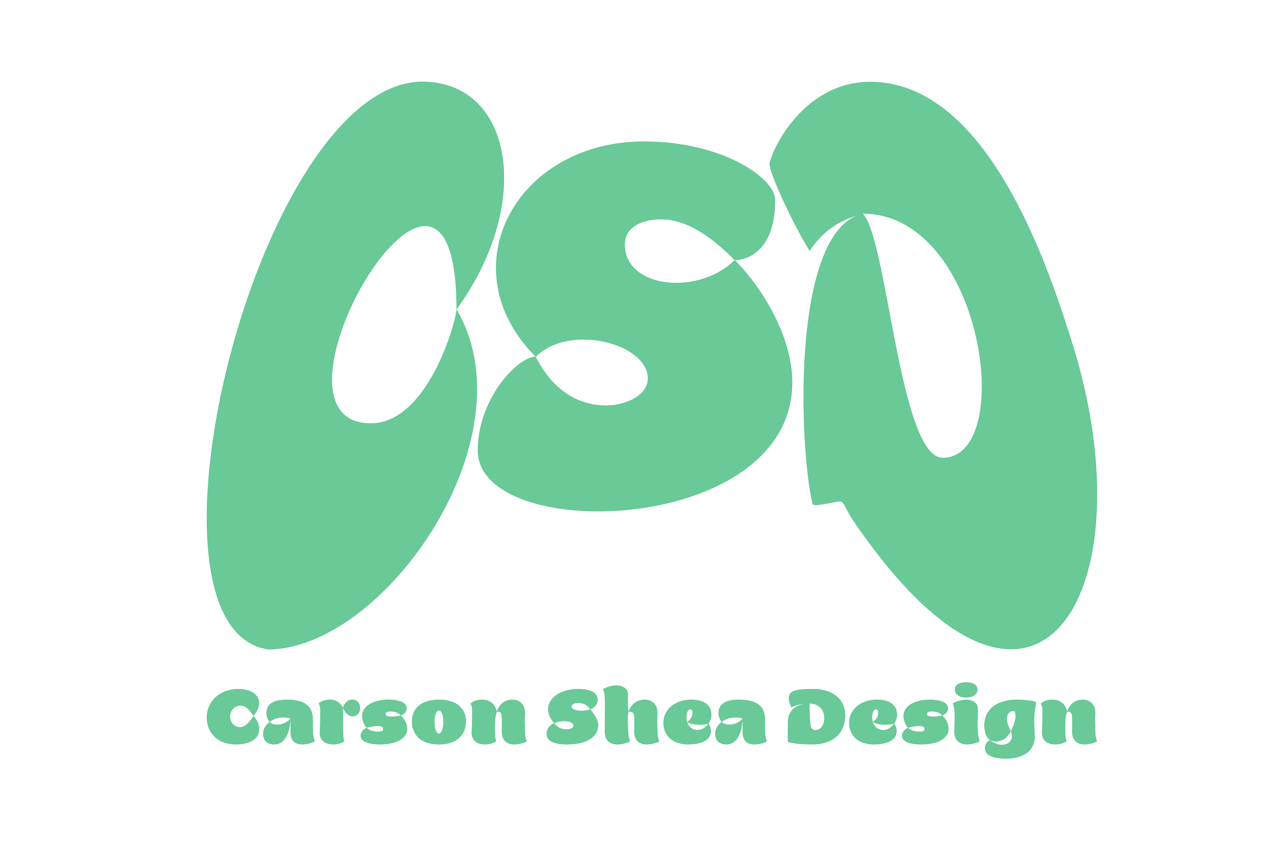
This was a personal project I completed with the task of redesigning the logo I use for myself, and designing the branding that I would also use. I first came up with the new Carson Shea Design name that I would be using for all my work, and then redesigned my logo to align with this branding change.
The Process
This project was completed by only using Adobe Illustrator.
First, I changed from the name Carson Shea Games, to Carson Shea Design, to focus more on graphic design, as well as include all aspects of design that I might possibly create.
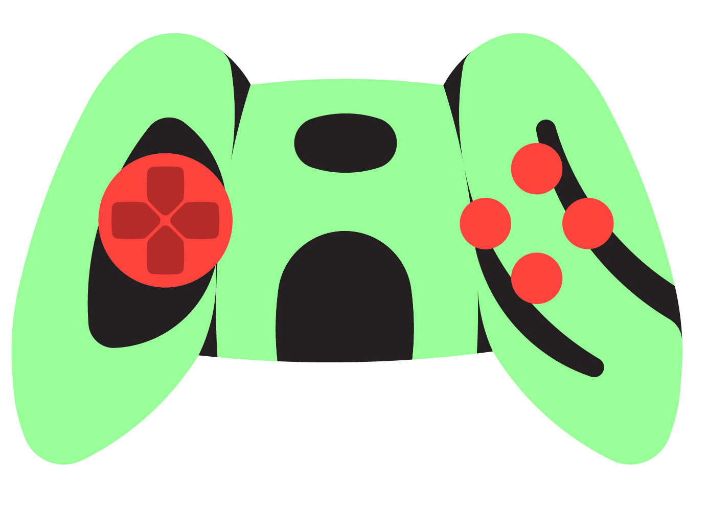
Then, I analyzed the previous logo to determine what I felt was working, and what could be changed. Some of the biggest things were changing the letters from CAS to CSD, as well as going with a 1 color scheme.
When it came to the design portion, I found the font Opake Heavy, which I felt aligned with my vision, and used a distort tool to make the letters fit within the game controller shape.
Finally, I felt that it was important to include the full name, so there is an acronym, as well as the full name, all in the same font.
Carson Shea Games Logo (2022)
Carson Shea Design Logo (2024)
The Purpose
As my interests and career goals were shifting away from game design, and toward graphic design, I wanted to respond to this change, while still leaving the door open for game design.
I felt that the old logo became a little too distracting with all the different colors and shapes, so I wanted to create a one color design, and make use of negative space instead of adding a second color.
I selected a mint green color, partially because it is my favorite color, but also because of the meaning associated with it. Since it is a color associated with spring, it has a meaning of new beginnings and growth, which I felt was a great representation to use for a redesign.
For the shape, I changed the letters used and felt that the shapes of C and D created curves that mimic the handles on a controller accurately, so I kept the general shape. Then, I wanted the letters to be more recognizable, so I maintained the font as much as possible and utilized a distort feature to align the letters with the shape.
With the font, I picked something that would create full letters and fill up the space within the game controller. There were also a lot of unique curves in this font that I liked and felt complemented the outer shape of the controller.
Finally, I included the full, Carson Shea Design, text so that the name would be more easily associated with the logo. Then the same font and color that I used in the logo is also included all throughout my site to create more cohesion in the branding.
